
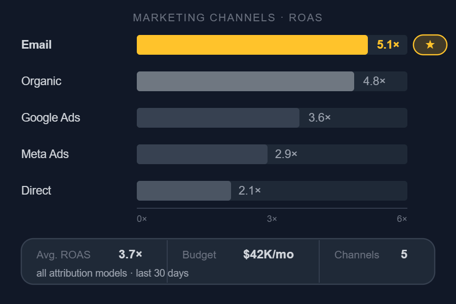
You already have a single source of truth — data from your store, ads, analytics and marketplaces gathered in one place and brought down to a common language. That's the foundation. But an organized dataset on its own doesn't yet tell you whether the business is heading the right way. For that you need two more things: goals arranged into a logical structure — a KPI tree — and a mechanism that watches those goals for you and lets you know when something drifts from normal. And once it does, instead of guessing, you drill down the same tree all the way to the cause. From KPI, through alert, to diagnosis.
A list of metrics is not the same thing as a KPI tree
Most companies have plenty of metrics. A dashboard where revenue, ROAS, session count, ad spend, conversion rate and ten other numbers all sit side by side. The problem is that this is a list, not a structure. When revenue drops, a list like that doesn't tell you where to look — it shows you twenty numbers at once and leaves you with the question "okay, but why?".
A KPI tree flips that logic. Instead of a flat list, you build a hierarchy: one top-level goal at the top, and beneath it the metrics that make it up — and so on, deeper and deeper, down to the levers you can actually pull. Every level answers the question "what does the level above it break down into?".
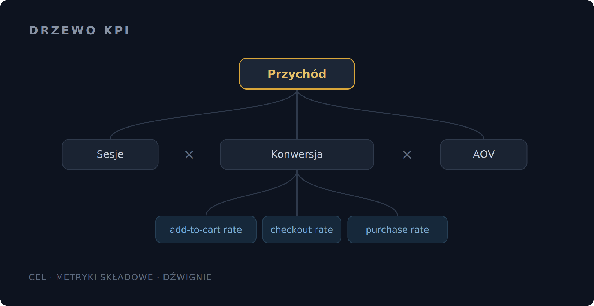
In e-commerce, the simplest and at the same time most important tree starts from revenue. Revenue from traffic isn't one number — it's the product of three: session count, conversion rate, and average order value (AOV). If revenue dropped, one of those three branches dropped — and you already know where to look next.
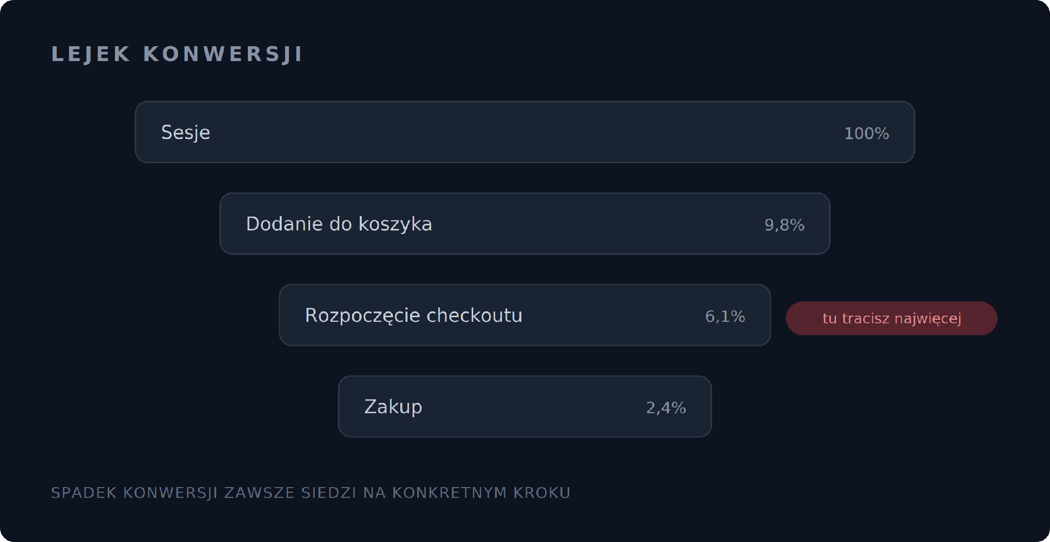
And each of those branches breaks down further still. Conversion rate isn't a constant either — it's the outcome of the whole funnel: of all sessions, some add a product to the cart (add-to-cart rate), of those some move on to checkout (checkout rate), and of those some complete the purchase (purchase rate). When conversion drops, you don't ask "why did conversion drop" — you ask "at which step of the funnel am I losing traffic". Because a drop at the cart stage is a different problem (price, shipping cost) than a drop at the payment stage (the gateway, the last step of checkout).
The same logic works on the ads side. ROAS is revenue divided by cost — so when ROAS drops, either cost went up or ad revenue went down. If cost went up, it's because the price per click (CPC) or per impression (CPM) rose, or you simply bought more traffic. Each of those "eithers" is a different branch and a different action.
A KPI tree isn't a prettier dashboard. It's a map that tells you upfront which way to go down when something breaks — instead of leaving you with a list of numbers and a gut feeling.
In WitCloud, that tree doesn't stay a diagram on paper — you build it as a concrete definition. You pick the metrics that matter to you from the All In One data, and assign three things to each one. First, related metrics — the branches below it that explain its movement: for ROAS you attach cost, revenue, CPC and CPM; for conversion rate, the next steps of the funnel. Second, comparison windows that make sense for that metric: some things you review week over week, others month over month, and for strongly seasonal metrics only year over year shows the real picture. Third, whether you want notifications when that metric drifts from normal.
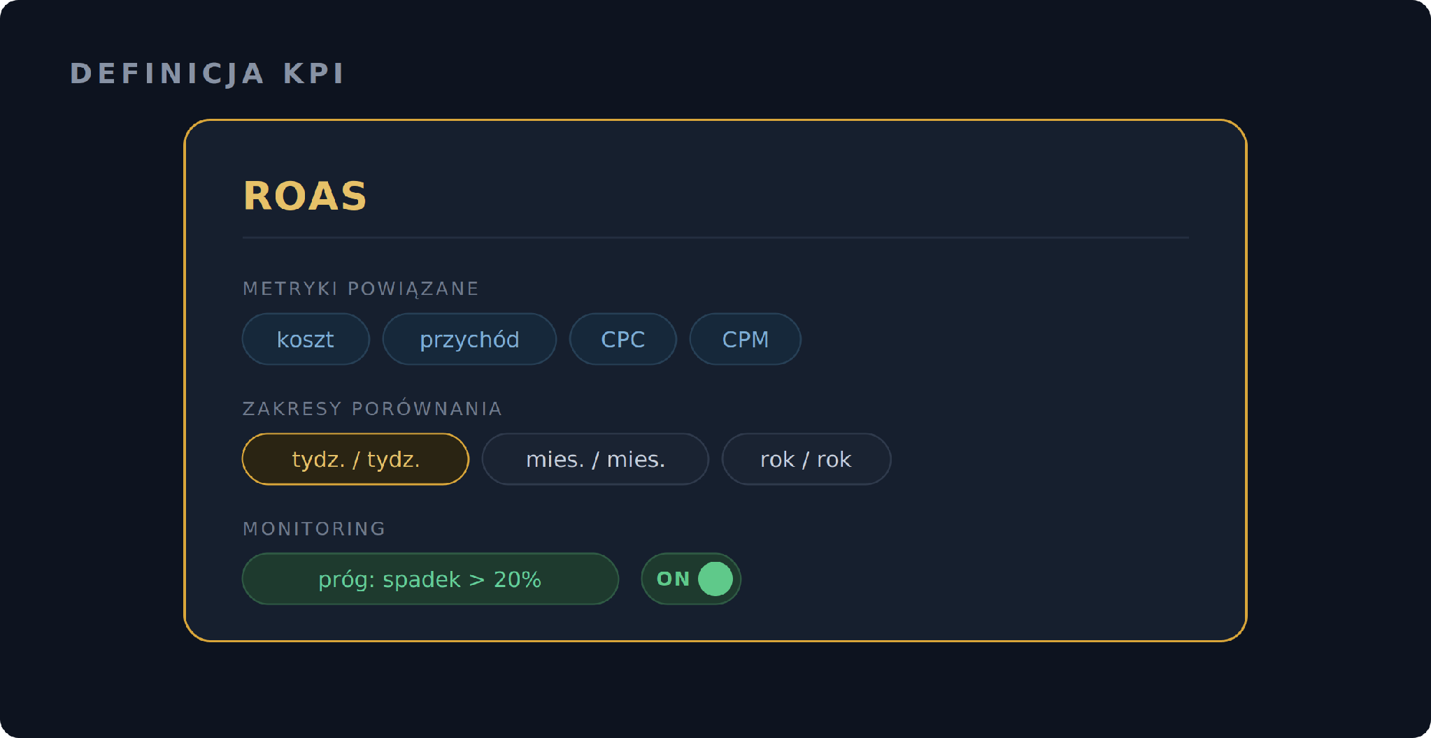
That way, one definition powers everything that comes after: it's what you drill down through during diagnosis, it's whose comparison windows monitoring uses, and it's what AI queries — through our connector. You don't maintain three separate configurations or paste anything into the model: you have one tree in WitCloud, and all three functions run on it.
And this is where the foundation from the earlier articles comes back. A tree like this only makes sense if all its branches are counted from one, consistent source. If you take revenue from one system, cost from another, and sessions from a third — each counting its own way and speaking its own language — the tree falls apart before you even finish building it. All In One gives it common ground: one data model, where spend and cost are already a single metric, and you know exactly which question CRM revenue answers and which one GA4 revenue answers.
You can't watch everything at once
You have the KPI tree. But a living tree for a real store isn't five metrics — it's dozens of branches across several markets, several channels, hundreds of campaigns. Nobody reviews that by hand every morning. And even if someone does, they'll only catch the big, obvious changes — the subtle ones that are just starting to build get lost in the noise.
That's why the second element is proactive monitoring. Instead of you logging into reports every day to check whether anything changed, the system does it for you — and you only find out when there's actually something to know about.
It works simply. You define which metrics are critical to you and what movement you consider concerning — for example "let me know when ROAS from the ad systems drops by more than 20% week over week", "when ad cost rises by more than 25%", "when order count drops by more than 20%", or "when conversion rate drops by more than 15%". Monitoring uses exactly what you set in the tree. Once a day, the system takes every metric flagged for tracking and compares it over the window you defined for it — day over day, week over week, or year over year for seasonal ones — checking whether the movement crossed the threshold. If a metric crosses it, you get an email notification. If nothing crossed it — silence, and that's good news.
The whole trick is in setting the thresholds right. Marketing data naturally fluctuates day to day — if you set a threshold too sensitively, you'll get an alert on every small wobble and stop reading them within a week. The threshold needs to sit above the normal noise, so a notification means a real change, not an ordinary fluctuation. That's why thresholds are picked for the specific business: what's sensible for a store doing 50 orders a day is different from one doing 5,000 — because at lower volume, every number swings harder. A well-set-up monitoring system stays quiet most days and speaks up only when it's genuinely worth a look.
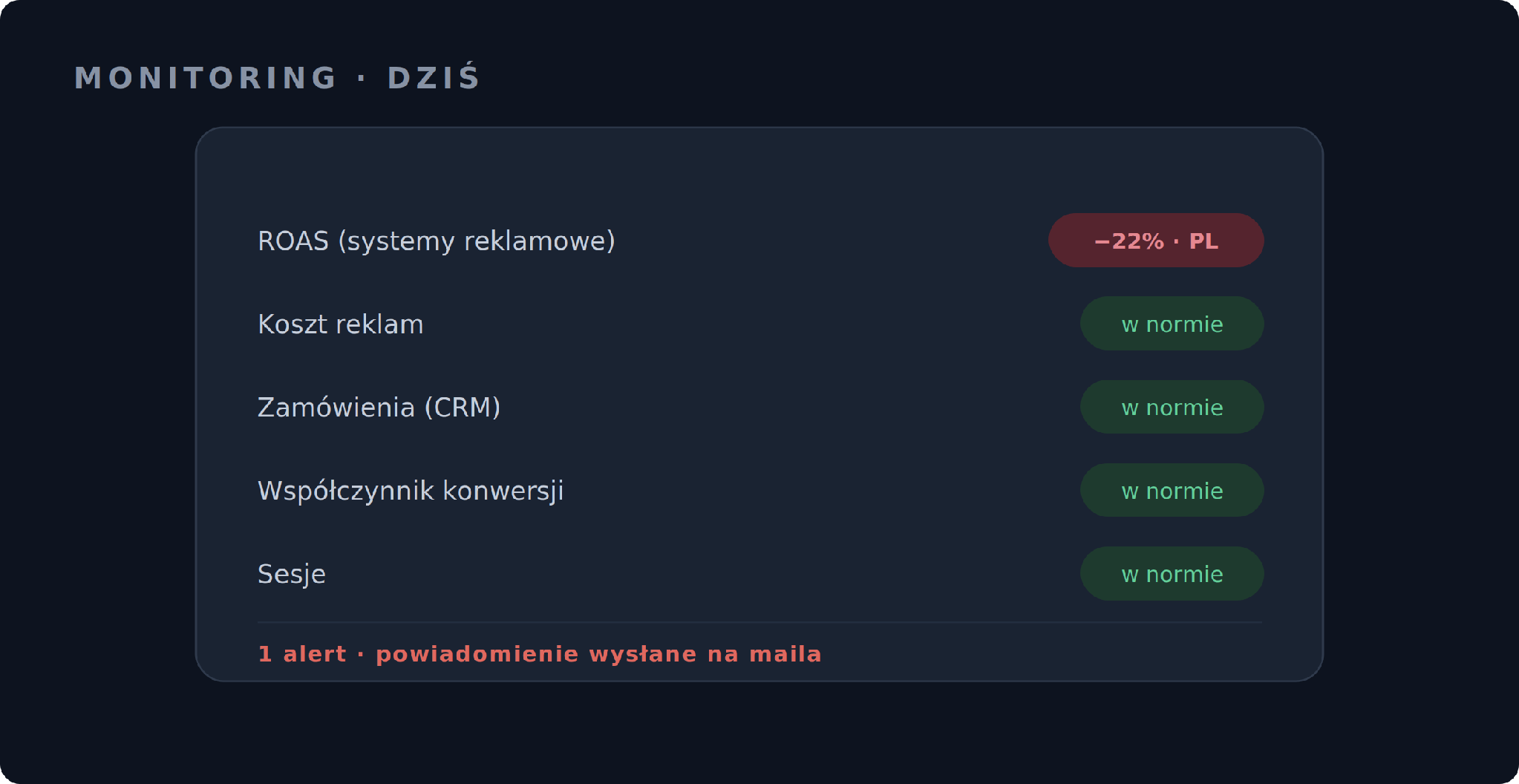
The key difference is in the direction of attention. Without monitoring, you have to remember to check the data yourself — and most often you do it too rarely, or only once someone notices the problem after the fact. With monitoring, the data speaks up to you. The anomaly reports itself on the day it appears, not at month end, when it's already too late to react to it.
And again — this only works because underneath it all there's a single source of truth. Monitoring calculates metrics from exactly the same organized tables you read your reports from. There's never a situation where the alert says one thing and the report shows another, because both take their numbers from the same place and the same definition.
The alert fired — don't guess, diagnose
You get a notification: ROAS in the PL market dropped 22%. This is the moment where most teams start guessing. "Probably seasonal", "maybe something with the brand campaign", "competitors might have raised their bids". Guessing has a cost — you either cut budget where you shouldn't, or you wait to react until the problem grows.
Instead of guessing, you drill down the KPI tree. This is exactly the structure you built at the start — now it works as your diagnosis path. There's one rule: from general to specific.
First you ask where. Since the alert is about ROAS, you break it down by market — which market is behind the drop? Say it's PL, while DE and CZ are stable. So you drill into PL and break it down by channel — which channel is dragging ROAS down? Google Ads. You drill into Google Ads and break it down by campaign — and you see one that stands out, where cost spiked and revenue didn't keep up.
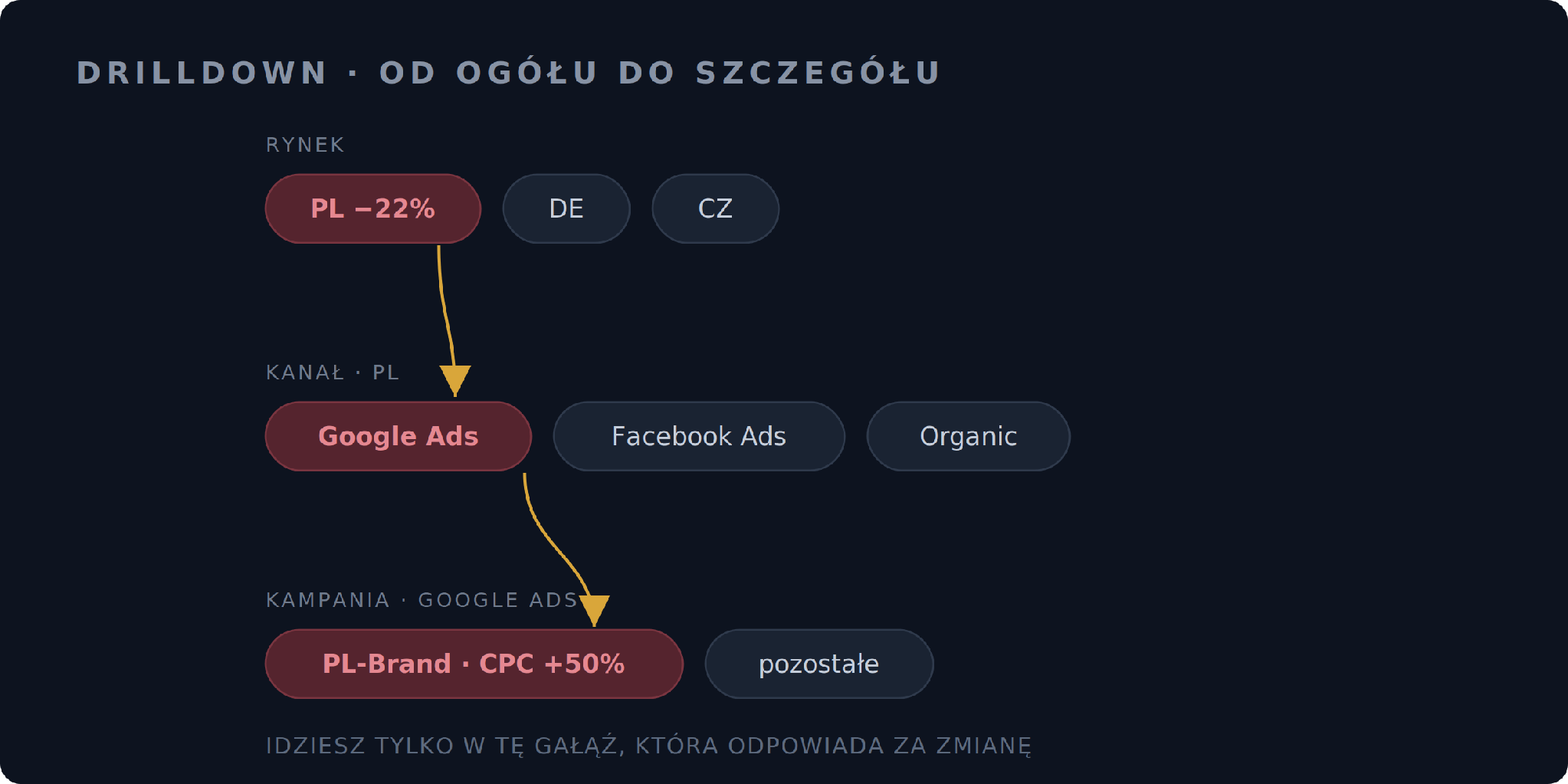
Then you ask why. This is where you decompose the metric itself. ROAS dropped — because cost went up, or because revenue went down? Turns out it's cost. So why did cost go up — because you bought more clicks, or because each click got more expensive? Turns out CPC rose by half at the same click volume. That's no longer "something's going on with ROAS". It's a concrete sentence: on campaign X in Google Ads in the PL market, CPC rose by around 50%, likely due to an auction shift, and that's what ate into ROAS. With a sentence like that, you know what to check and what to do.
And here's where an important choice comes in: how to run that diagnosis. There are two paths — and both go down the same tree, from the same source of truth.
The first is self-service exploration in the report. WitCloud provides a ready-made template — the All In One report — where your data is already arranged around real questions: markets, channels, campaigns, funnel. You click through the levels yourself: filter by market, drill into a channel, break down a campaign, look at the levers underneath. Some teams simply like this mode — they want the data under their fingers, laid out where they expect it, and would rather browse a report than ask anything. That's completely fine, and we're not taking it away.
The second is exploring with AI. Instead of clicking, you ask directly: "why did ROAS in PL drop?". And here's the crux: the KPI tree you set up once in WitCloud is immediately available to AI. The question goes through our MCP connector straight to that same tree, and the answer comes back in a few seconds. You don't paste anything, don't rebuild the configuration a second time, don't export data to the model — the definition sits in WitCloud, and AI simply queries it. The model then walks the same path you would in the report — it breaks the metric down by market, drills into the channel, then the campaign, checks the levers underneath: CPC, CPM, conversion count, order value — only it goes deeper, and at the end it gives the most likely cause along with a concrete recommendation. It doesn't hallucinate over raw, contradictory tables — it explores the same consistent dataset you read your reports from.
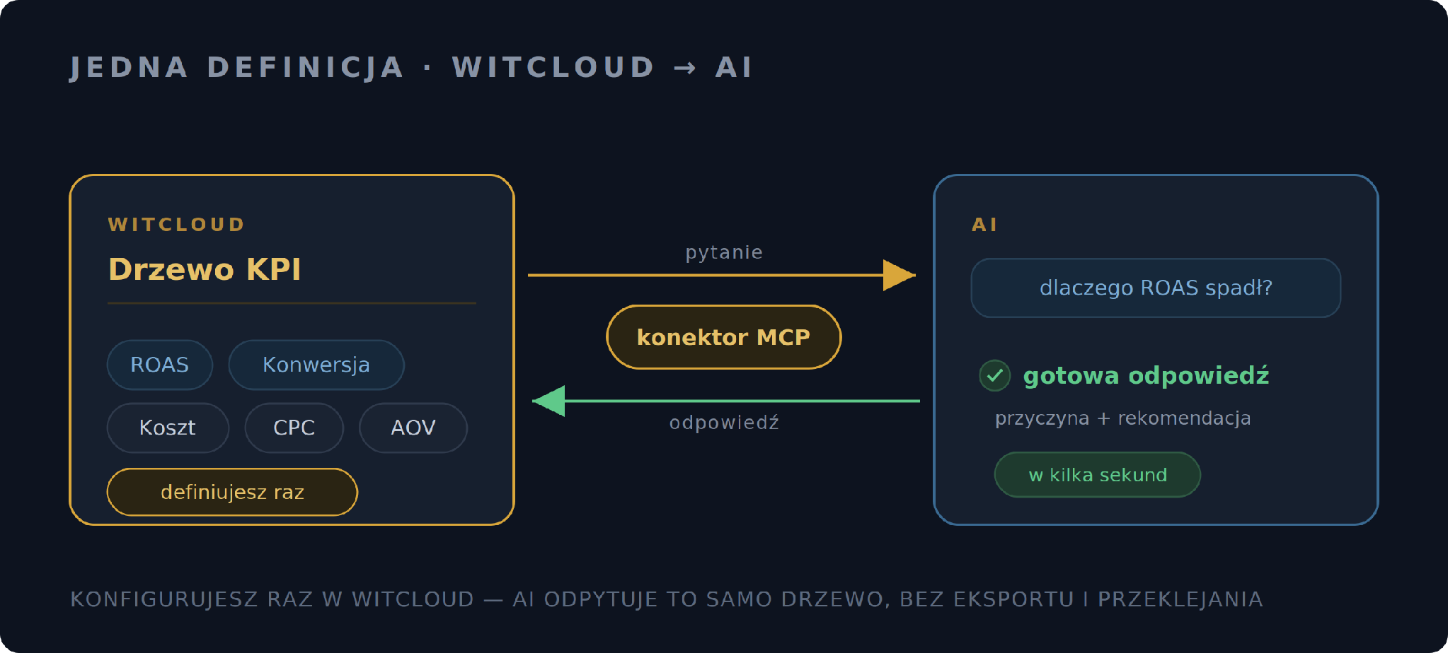
We recommend AI the most — because it drills down the tree faster and deeper than you would by hand, and it doesn't get tired at the tenth branch in the middle of the day. But the report stays, deliberately: not everyone wants to talk to a model, and a good, well-organized report is often the fastest route to an answer when you know exactly what you're looking for. What matters most is that both stand on the same source of truth — so whichever path you take, you arrive at the same number and the same cause.
And one more thing AI gives you beyond a manual drilldown: it doesn't have to limit itself to a single alert. Since you've already defined the whole tree in WitCloud — with related metrics and the right comparison window on every branch — the model can walk through all of it through that same connector. It takes every metric, checks it in its own window, drills into wherever something stands out, and hands back one coherent health check of your entire marketing at once — from the top of the tree down to the levers you'd otherwise drill into by hand anyway. That's no longer a reaction to a single signal — it's a full diagnosis on demand: "go through the whole tree and tell me what needs my attention".
Diagnosis isn't another tool — it's drilling down the tree you already have. The alert tells you what and where. Drilldown tells you why. AI does the same thing, just deeper and faster.
It's worth adding one rule that guards against a wrong conclusion: diagnosis doesn't mix sources. If the alert is about a metric from the ad systems, the whole analysis drills down through ad data. If it's about the funnel from GA4, you drill down through the GA4 funnel. You don't combine revenue from one system with cost from another halfway through a drilldown, because then you're right back at the mismatched-numbers problem from the data quality article. Every diagnosis path stays within a single source of truth.
From goal to cause — without guessing
Let's put it all together. A single source of truth gives you consistent data. A KPI tree gives it structure — and you define it once, assigning each metric its branches, the right comparison windows, and whether you want to monitor it. Three things stand on that one definition: monitoring, which watches it for you and speaks up on the day something drifts from normal; self-service exploration in the All In One report; and AI, which will drill down from a single alert or walk the whole tree at once and tell you what needs your attention.
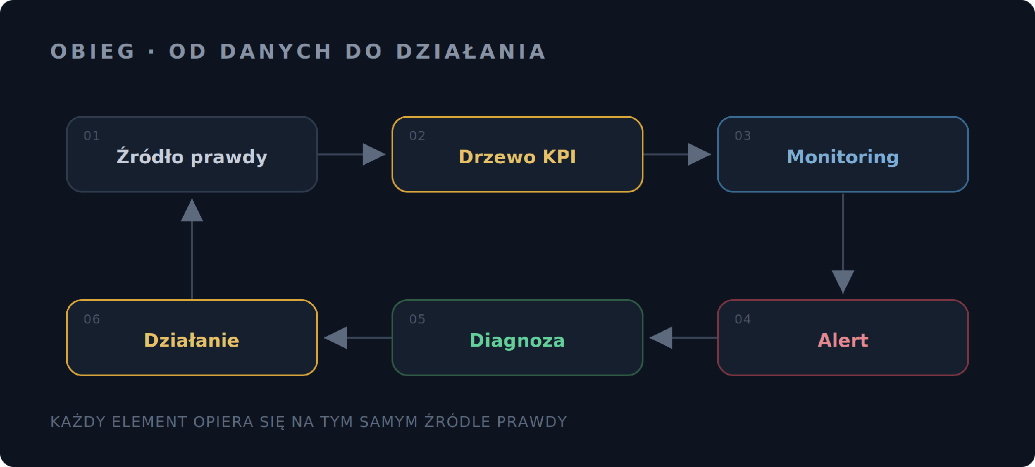
The effect is that the path from "something's wrong" to "I know what and why" shrinks from days to minutes. You don't have to stare at dashboards every day or guess where to look when the result drifts from plan. Your goals are laid out, the system watches them, and when you need to dig into the data, you have a ready path and a single source to follow.
The best moment to put this in place is once the foundation — a single source of truth — is already standing. And if it isn't yet, that's the first step we start from. Instead of chasing results after the fact — keep your marketing under control, from KPI to diagnosis.